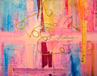
Well, this photo looks a tad "pinker" than it really is...it's really more purplish. My ideas is to get away from traditional red and green and go with the purples and gold of the Church colors for Christmas. With a little Phalo Blue for contrast. The thinned acrylics were rubbed onto the gesso textures with paper towels. I've added some tinted sheet music with words that seem to tell of memories, friends, and golden times. That's sort of the theme.
My original thought was to add tinted and aged photos of family gatherings but I see that it is really too small a piece (11 x 14) to do that well. So now I am thinking of maybe using photos of us and the grandkids...collaged in. I am not sure...It could get too busy that way.
I need to let everything dry now and then come back to it. Maybe just one strong image somewhere near the center of interest.


Before.
I LOVE THE COLORS.VERY PRETTY.
ReplyDeleteGRANNY FROM FLORIDA