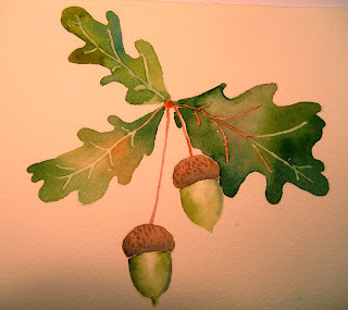
An interesting project has come up for my weekend painting. My friend, Kendra, wants to put a "logo" on some stationery and brochures, etc. for her nature and forestry center. She knows she wants oak leaves and acorns. She knows it has to be a simple image. My first image is a classic watercolor. It might work for some of her needs and probably not for all.
This image is almost the same but stylized and inked. Simpler.
Last I did add a negative image. Just in case she might find that an interesting option.
More to follow and I'll let you know if any of these worked for her. I think she is thinking tee-shirt or maybe cap logo and she probably has some printing that will go along with it. I am sure she plans to reduce the size way down.


No comments:
Post a Comment