Showing posts with label composition. Show all posts

Tuesday, February 1, 2011

Yupo Demo

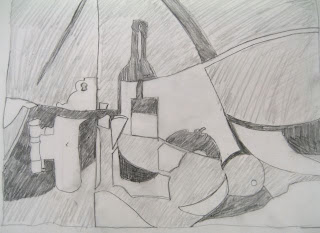
During the Watercolor on Yupo class yesterday I started this demo. It is just blocked out at this point. It is a half sheet.

I decided on a still life/ interior. I did have a photo for inspiration but shortly after doing the sketch I misplaced the photo...which is probably just as well.

Right now I am just looking at shapes and lights and darks...trying to connect some of the shapes and look at some of the values. Although in Yupo everything is possible. I can get back the whites and go back in with darks at any time. I think it is harder to stop painting in Yupo because of that.

I still have lots of ideas about how to manage and manipulate the paint and push the textures a bit. I want to work on the dresser so it is not stark white but is still a light. I am not too sure about the tangent line of the mirror behind the lamp...I may "fatten" up the lamp a bit. I haven't decided how the ams on the chair will work in yet. There are some books stacked on the dresser (a chance for another shape and a way to connect darks?) So many fun things to think about.

We had a really nice group at the class Monday morning. 8-10 people and lots of good discussion and we watched part of the George James Part II DVD.

Pat shared one she did after the last class and she had traced her drawing onto the yupo using a waxy carbon paper. What happened was the lines resisted the paint. It was an unexpected surprise! I will try to get Pat to send me a good photo of that as it really turned out quite uniquely. I think you could do this with wax paper too.

Happy Ground Hog day tomorrow!
Also I hope all of you are safe on this blizzard day! OH my gosh. Couldn't be happier to be in Florida right now!


Thursday, September 23, 2010

Blocking In

Today is a good day to do a little work in the studio so I pulled out that image I did of the Apple Cake ingredients.

I did the preliminary sketch in pastel pencil on 16 x 20 canvas over black gesso. Next I will go back and see about light/dark, how to indicate the light source and what details I want to put in. Here I am just looking at composition and a little work with how I want to arrange the colors. Just fun! All girls want to do is have fun!

It is POURING rain in the north woods today. We are under a flood warning! But it cozy in the studio with music on and the sounds of the rain on the roof.


Thursday, August 5, 2010

"Autumn Forest" Nearing Completion

I've had a few good suggestions and a few ideas of my own on some improvements. (scroll back one post)

I didn't like the sameness of the two brown trees and so that one became larger and longer and developed a branch that went off to the side. One of the colored trees got a bit larger. And I covered the bit of light colored leaves on the forest floor as sticking out and not adding to the composition. Acrylic is nice for making changes, isn't it?

I like how the rocks repeat the colors in the sky and the background in the painting.

You'll notice I haven't signed it yet. Still musing.

The acorns are falling now in the north woods and today the temp never got above 65 and sunny and windy. A very autumn like feel to the air!!! So I felt inspired to work on this.

I missed my en plein air group this morning due to company coming up from Pewaukee for lunch. Hopefully in a few weeks I can join them again.


Monday, June 28, 2010

Sunflower Underpainting

This is the acrylic underpainting for one of the paper paintings that I plan to use for the demo in July. (I think). I have always liked this photo I took of a pot of fresh picked sunflowers.

Compositionally I probably need to pull one of the flowers out and let it touch the right side (as in the photo. I see that now that I have looked at it online.

I stopped before I put in the red in the photo. I couldn't decide if that bright red added or detracted from the main subject matter. But the more I look at it, the more I think it might be a good dash of color...if I keep the red on the warm side for the foreground...hot red...orangey red.

I have never done a floral in paper painting. This should be interesting!!!

Gray, windy, 58 degrees in the north woods on Monday. Sigh. Not raining at present. Just gloom! But the music is playing and the coffee is hot and I have cookies baking in the oven. So never mind!

AND I have some lovely fun painting to lure me away into the studio later.

Tuesday, June 22, 2010

Critiques of this painting

I've had a lot of good suggestions regarding this watercolor/gouache painting.

So, I've added some trees off to the left side in the background. I've extended the fence line to the right edge. I've softened the darkness between the slats of the fence to a grayer tone (from sharp black). I've added a few see-throughs and made the large light colored tree in the background have a little more interesting edge.

My friend, Carolyn, says it suggests water to her off behind the tree line. That was unintentional but I "could" make that more intentional by putting a dim horizon in blue off in the distance behind the tree trunks. That has some appeal to me. What do you think? I really feel the composition is much stronger now. Many thanks for the ideas!!!

Sunday, June 20, 2010

Watercolor and Gouache

Rhonda has been talking on her blog lately of the difficulty of critiquing one's own work. Amen. A common complaint for sure. Getting some distance helps. Squinting helps. And having a "list" of what you want in your painting helps. I also think waiting a few days and going back gives you fresh eyes. I think looking at it upside down or in a mirror can offer ideas. Laying a mat on helps focus your eyes.

I am laying a mat over this now to look at design elements. Light/dark values? Do the darks and lights "carry you through the painting?" The addition of the thrown shadows from the left of the painting helps to tie the the darks together I think. And the shadows the couple make tie them to the fence. The whites dance around through the painting nicely. The center of interest seems to have the best contrasts which is what I aimed for.

One thing that I usually critique myself is temperature..does the painting make a point of being more more warm or cool rather than balanced. I see this as high key and warm.

The one area I can't make up my mind about is edges. Usually I try to have balance of soft and hard edges. The trees and flowers do have softer edges while the people and architecture have harder edges. Gouache tends to have a "flatter" look about it than transparent watercolor. For some reason, to me anyway, that brings the sharp edges more into focus.

I left the corners on the bottom left and right white. I tend to have a bad habit of putting dark shapes into corners and drawing your eye away from the center. I wonder if anyone has a problem with those spaces?

In some ways I see this as an abstract of shapes and colors. I have reworked the shadow and shapes in the center of interest and behind the umbrellas several times. That is one of the nice things about gouache. Like other opaque mediums you can go back and layer and completely change a color or shape.

It seems as though, each time I paint something I have in my head that I am going to work on one or two things more experimentally. Either I am going to explore a new medium, or a new support, or a new tool, or focus on design more, or some of the other things I mentioned above. I keep "hoping" that by doing this eventually the critique will "internalize". I'll be able to keep all those things in the back of my mind somewhat unconsciously. (hahahaha...it's a goal anyway.)

This painting had a working title of "Out For Lunch" but am not liking it anymore. Ideas? It is 11 x 15 on Arches hot press paper.

Wednesday, June 16, 2010

"Out For Lunch": Gouache and Watercolor

Some one of my blogger friends sent me the original photo that is the inspiration for this painting (with permission to use it) I added the figures and redesigned the space some. (I am fond of umbrellas.)

This is what I worked on in Karen's class today. Watercolor and gouache.

I learned more about how to manipulate the two mediums. And why many artists prefer to work with white gouache and watercolor rather than buy gouache paint.

The answer is that the combination of the transparent paint and the opaque paint has a special quality you don't get with gouache alone (which is flatter and chalkier). AND I learned that you can do a wash with gouache over watercolor or over other colors of gouache.
Karen had us do some preliminary exercises on wet paper adding watercolor and then white gouache. Blending and allow some surprises to happen. She often then uses this as an inspiration for a painting.

She also worked on a floral in the afternoon which she drew first using both transparent watercolor and adding gouache with it both wet and dry.

I was not in the mood for a floral so I used the drawing that I brought with me for my work in the afternoon. I still have a long ways to go and with gouache you have the opportunity to re-do so many things. I am particularly unhappy with the grays in the background behind the umbrellas...I'd like some muted and softer shapes but not what is there. I need to work through the figures so they do not distract from the center of interest but lead into it. I need to resolve both the left and right sides of the painting in the same way..interesting shapes but not pulling away and not too much detail or contrast. A nice day and a great group of people. (No rain today but no sunshine either. We all have our fingers crossed for the plein air tomorrow morning!)

Saturday, March 6, 2010

Deciding temperature

A painting should make up it's mind if it's going to be warm or cool, not half and half. It should lean one way or the other. Most of my architectural snow paintings have leaned fairly cool. But something about this subject matter and the delight of the wonderful snow-filled trees overpowering the house, spoke to a warmer painting. And perhaps the influence of the title I had already chosen as well: "The Day Before Spring". So a sunrise was born with glazes of aurolin yellow and rose madder genuine and a touch of cobalt blue.

I am taking a lot of license with the painting now...dropping off the neighbors house and balancing it with another pine tree (that may or may not actually be there...hard to see in the snow.) There was a lot of "masking" as all the snow is actually the white of the paper.

In my dreams last night I was designing some of the shadows that would fall forward in front of the house (not available in the photo, of course). I pulled out my white acrylic ink which I think I will use to add more tiny white branches later and to use for touch ups. I relate to the lovely big tree in the front yard..reminding me of my big old oak back in Wisconsin that got sold with our house a year ago last September. Down here in Florida when the live oaks get that old, the branches sweep down to the ground like a ball room dancer in a heavy gown. Then the old branches touching there re-root into new trees.
Watercolor on Arches cold pressed 11 x 15.

Saturday, February 27, 2010

More Clownin' Around

Actually I have fallen love with all the clown words!!! BUT...it's still a big space with all the same value in it. So I may do further consideration as I finish up.

I think what I am going to do is crop the painting right down close to the tops of the clowns hats. When I do that I kind of like what I see in interesting negative spaces.

This is going to make a darling greeting card too.

Rainy days are great days for painting and it's been pouring here in Central Florida most of the day.

Watching Art Emerge off the Page

There is something really fun watching a piece begin to almost "leap" off a page of paper.

This is about 20 x 20 watercolor on Arches cold press. I may crop it into a horizontal piece when it's time to frame.

I haven't done much shading on this yet.

It's fun to notice how randomly the clowns seem to have collected for the photo in such an interesting way. I am also suddenly very aware of their unique faces...and remember being told by a clown that each face is like a copyrighted image for that particular clown. In fact it can actually BE copyrighted.

Egg Register

When a clown joins Clowns International in England, which claims to be the oldest clown society in the world, he can register his individual make-up. An eggshell is decorated as a miniature version of the clown's head and added to the "Egg Gallery" which then acts as sort of clown copyright. There are genres of clown faces based on famous clowns of the past.

In the photo I took it is dark behind them. And I am beginning to think about background now a little. I had originally thought of large stripes behind them...sort of a circus background but I can see the foreground is so busy now with their great costumes that I will probably need a resting place for the eye back there. Another thought I had was to have some printing behind them about the history of clowns...or words that remind us about the history of clowning....words like Buster Keaton, Red Skelton, Emmett Kelley or hobo tramp, bum, mime, bouffon, jester...etc. You can read a really interesting bit about clowning on Wikepedia.

One interesting side issue in the article is a short paragraph about "fear of clowns". It even has a name: Coulrophobia. Interestingly the article points out that where and when you encounter a clown is usually the issue. In a circus or a parade or a party they can be fun. But they can be frightening, especially to younger children if encountered in surprising places. Someone once said, "there is nothing funny about a clown in the moonlight." Fascinating. That is making me think twice about putting a dark background behind these clowns!!!

ps. if you really want to see a funny clown routine and have 6 minutes to spare go here.

Saturday, February 20, 2010

Pretzel Wagon Revisited

I have cropped this image slightly...but I am not sure...I may have cropped too much (I just laid a mat over it...I didn't actually cut the paper). I added a few more details on figures, added more dark behind the standing figure, changed the shadows a little bit under the wagon, added shadows under the figures, inferred another awning behind the trees and put some texture into the foreground.
I'm trying to find that elusive "interesting place to stop".

Friday, February 19, 2010

Composing the Pretzel Wagon in Yupo

I have added 3 figures and moved the composition along off to connect to the right side of the painting. I want to see the 3 figures actually as "part" of the wagon shape. Connecting them. Now I need to think about the left side and create a little more interesting shapes there without over complicating the painting too much. I like the light in the center of the painting and want to continue to infer the light is coming from the right side...I'll throw some shadows under the figures too once I get them more to my liking. I am thinking more of a cruciform design now as this moves along. So I'll need some shape to connect to the bottom of the painting as well. I love this part of the painting process.

Thursday, February 11, 2010

Back in the studio on Thursday

Gosh it feels good to be back...although it hasn't been all that long. I've been going through allergy testing. Never had so many needle pricks in my life and the blood draw got botched and I ended up with huge hematoma on my left arm! Sigh. Didn't feel much like painting for a day or two. Good news...NO allergies at all!

So in prep for teaching my last Yupo class next Tuesday I thought I'd sort of float back into a subject that I've been interested in trying...this fine little rolling food stand from the local flea market.

This is just the first "layering" of the watercolor on the Yupo paper. So much more fun ahead. Push pull colors and shapes. Probably some people eating at a table or a repeat of the some of the shapes behind...so many ideas floating. I love this stage. The Stage of Possibilities. When my mind begins to whirl with how the "theme" will affect the composition. Lights and darks. A little chimney goes on top. Drawing is done in watercolor pencil on this.

I'm going to try using an atomizer on this one in places. Ever tried those? I learned it from John Salminen. More to follow.

Tomorrow I am head to Ocala with 3 other arty friend to see the exhibit at the Appleton Museum. I'll report back on that!!!

Wednesday, January 20, 2010

Looking for an "interesting place to stop"


Remember what Judi Betts says? "A painting is never finished. You just need to find an interesting place to stop." Hmmmmmmm.

This is just a "demo" painting where I am trying to show my future students some of the possible techniques they can use on Yupo paper...that synthetic Japanese paper that is just so tantalizing and strange.

I am finding it hard to stop! Hahahaha. My major problem in Yupo is always "darks". You can always add them, thank heavens. Same problem in my Taco painting from yesterday!

I think I need to tone down the whites in the chairs in places to give them a little more depth. I am not so sure about the sort of "organic" feel I added under the chairs. My thinking was to "infer" that they were outdoors near grass. But I am not sure I am liking that.

They are "floating" which may or may not be what I want. I think having the class watch me tinker with this one will be fun. I don't have a lot of time invested in it so anything goes on it. I love the funky organic blobs on the right but I am not sure they really add much to the painting. They may be cut way back or perhaps they need repeating somewhere else?

Friday, January 8, 2010

Whisking along.....just a little pun

Well, adding the wire whisk to the still life won the vote 8 to 1.

So this morning I added it in.
The previous version is below.

It's a subtle change in the painting. My hubby thinks it helps push the words into the background more...gives it a little more depth. I feel better with 3 things in the container. Just click on the image for it to enlarge slightly.

16 x 20 Acrylic on canvas. I think I'll paint the edges just in case I want to hang it frameless.

Rainy and cold here in FL this Friday afternoon.
Perfect day in the studio. Now back to that collage of the bears to see if I can follow Elizabeth's critique and get it more finished.


Wednesday, January 6, 2010

Wrapping Up Loose Ends

This 16 x20 acrylic on canvas has been sitting in my studio for about 8 months..half finished. It's not like me not to finish something once started BUT I am learning some patience these days. AND I am learning that given a bit of distance you can see all kinds of possibilities in a painting that you did not see before.

I started this in Diane Barringer's acrylic class in Jan Sturm's garage studio (here in Fl screened in garages are quite posh) way last winter. She laid out the apples and the cup and the pot (which was actually a flour sifter). I can remember if was draped at the time or not. About everything in the picture has changed color at least once!
Finally when the striped table cloth came to my mind, I began to actually "like" the painting. A little.

Then last week someone sent me an on-line video of Susan Webb Tregay doing some "repair" on a watercolor and I emailed a Lou about it and she rushed over with Susan's book called Master Disaster: Five Ways to Rescue Desperate Watercolors. Don't you wonder how this affected an acrylic painting? (Incidentally, I found her book for about $3 on used book section of Barnes & Noble.) Anyway, the thing I loved about her book was her outside-the-box thinking...something I've been striving for lately. And I suddenly saw the printing behind my still life. It came to me a dream! I kid you not. I do my best painting in dreams.

Okay, here's my last decision. Should I add one more thing into the kitchen utensil pot? My idea was a wire wisk partially covering the word "kitchen" but leaving it legible. I like things grouped in odd numbers and the two in the pot bother me a little. I had originally thought to stencil on one more word on the backgorund. But now I think that may just be too busy.

Saturday, December 12, 2009

Mossy Cottage: glazing

Now it's probably time, as Judi would say, to "step back and think awhile".
The last two washes and some details have warmed up the painting considerably. I am using Judi's ideas about not painting in the windows some dead dark...but rather warm darks in layers. I think they will need to go darker as the painting progresses. Like Judi I am trying out oranges and orange-pinks and warm grays in the windows. I am trying not to cover up the nice early washes. I am thinking I may come back now with background greens because that is going to "pop" out the shape of the cottage and change the contrasts between the colors. So I want want to tweak some colors when that is done. At the very end, Judi often glazes areas of the painting to help you focus on the center of interest which in houses is "usually" doorways. The brick steps make a nice eye lead in for that. Judi keeps her foregrounds very simple and quiet so as not to detract. That will be a challenge. I may just imply and vignette it off.

Judi says that "No painting is ever done. You just learn to stop in interesting places."

Thursday, December 10, 2009

Looking at Judi Betts


I just thought real quick I'd show you one of Judi's architectural designs..similar to the one I am looking at on her video right now. Look at those shadows! Look at the wet juicy blends! Look at the design and composition! Yummy yummy yummy.


Now this is quite different from my usual style (see above). So I am challenging myself now to think a little differently about this piece. So...more about this journey as it unfolds.

Monday, December 7, 2009

Fun at the Mt Dora Art Show

I got a ribbon for this painting at the Mt Dora, FL show this weekend!

This is an Yupo painting I did on semi-transparent Yupo paper with watercolor. It is from a photo I took on Cedar Key last spring of an old crab fishing boat that looked to have been put out to pasture.

The name on the transom "Miss Clarabell". So, that is the name of the painting, of course. I had some fun designing this one with some press-on textures. I liked working with the transparent Yupo as it gave me a chance to do things like design a crab image (top in red) and then to place it under the painting and trace the object wherever I wanted to place it before making a commitment. Haven't done a Yupo since this one. I would like to try some fluid acrylics on Yupo...I see them on Sandy Maudlin's blog but have not tried it yet.

Thursday, November 19, 2009

Carol Steven's workshop


Today was my day to think more "abstractly". Starting with the black and white photo and then moving back up to the top, you can see how Carol teaches the progression into an abstract painting.

This is, of course, MY version of how to do it. Everyone in the class had VERY different versions.

We worked in watercolor and collage but it would apply to any medium. We traced the photo (or painting) twice...first just an outline and then a second time she had us pick the center of interest and draw some lines that would separate the center of interest from the rest of the painting and then design the lights and darks. Then put what we drew onto the watercolor paper and begin.

I don't think abstract is my "thing" BUT I did find it refreshing and relaxing and I would do it again.