Saturday, June 25, 2011

Christmas Collage Fun

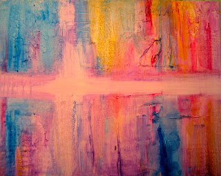
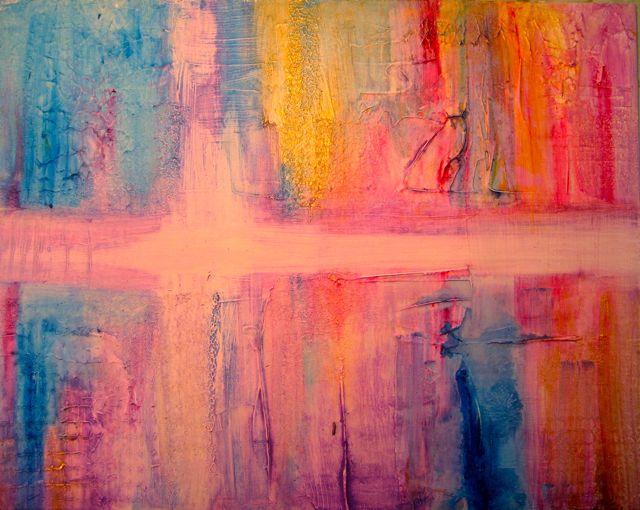
Well, this photo looks a tad "pinker" than it really is...it's really more purplish. My ideas is to get away from traditional red and green and go with the purples and gold of the Church colors for Christmas. With a little Phalo Blue for contrast. The thinned acrylics were rubbed onto the gesso textures with paper towels. I've added some tinted sheet music with words that seem to tell of memories, friends, and golden times. That's sort of the theme.

My original thought was to add tinted and aged photos of family gatherings but I see that it is really too small a piece (11 x 14) to do that well. So now I am thinking of maybe using photos of us and the grandkids...collaged in. I am not sure...It could get too busy that way.

I need to let everything dry now and then come back to it. Maybe just one strong image somewhere near the center of interest.

Before.

Friday, June 24, 2011

Pondering

I recently wrote an email note to my former roommate from college. Now note, I did not say my OLD roommate from college. This would predicate the need to remind everyone that if this person was my roommate in college, how OLD would that make ME?

So anyway…this email I sent to her first was a reflective piece on aging and time, and precipitated by our upcoming 50th college reunion in October. I concluded with “It's just part of being human...struggling to help each other along the journey and sharing adventures along the way. The sweet sadness of time passing. We need to hold hands as we cross the streets. “

So now she has me labeled as “person who likes to ponder”. So she sent me a list of silly things to ponder like Why isn't the number 11 pronounced onety one?

Actually I do ponder things like that! :-)

Meanwhile, the whole thing started when I went back to re-read the Christmas cards and letters from last Christmas (I always do this in the summertime) and started thinking about a collage for my Christmas card this year. THAT is what this strange surfaced canvas board is all about. The support for a collage. A Christmas theme…pondering Christmas past for hints on how to live for Christmas present. Ideas anyone? Are you pondering?

Tuesday, June 21, 2011

The Re-Do

One really nice thing about the iPad as a resource for photos is the ability to go back and look at a painting and use some of the original painting for the re-do. Naturally, the original is no longer in my possession. Neither is the original photo unfortunately. But with the photo...I could make a reasonable stab at the re-do.

Basically, as I noted in the previous post, white oak acorns do not have "stems" and so they had to disappear and the leaf lobes needed to be deeper. So we'll give this a try!

Meanwhile we are being drowned in Northern Wisconsin. Whew. RAIN RAIN RAIN. High of 59 today. How's that for the first day of summer! No sunshine in sight until "maybe" Saturday.
If this sounds like a little weather whining...well, so be it!!!

Our bathroom remodeling is really moving along, however, since we are not tempted outside. I may post a few photos of that. Painting is painting?

Sunday, June 19, 2011

White Oak Commission Revisited

Well, it's time to re-visit the oak leave/acorn commission in a slightly more "botanical" way.
Come to find out what Kendra wanted were WHITE OAK acorns. Good old Quercus Alba. Of course, why didn't you say so.

White oaks are 60-100 feet high, 2-3' in diameter..tall and straight in the forest, rounded in the open...with irregular and heavy limbs. (You don't want one of these babies falling on your roof!)

Bark is pale gray and scaly and the leaf is deeply lobed. Sometimes the leaves remain on the tree all winter.

The fruit is a light brown (green in spring) acorn maturing in the first year enclosed in a cap.

The white oak is common on better soils in the southern half of Wisconsin. It's wood is light brown and is good for heavy construction, railway ties, interior finish, furniture and fuel.
Forest Trees of Wisconsin, Department of Natural Resources Bureau of Forestry 1990


So...the issue of making these more botanical than previously posted has to do with more deeply lobed leaves AND the acorns are NOT on stems as previous drawn but rather close together on the twig near the leaf.

Thursday, June 16, 2011

Solace when the En Plein Air gets rained out....

Well, actually my en plein didn't get "rained" out, it got "darkened" and "cloudied" out. My spell checker says there is no such word as cloudied. Hahaha. But believe me, it was dark all day...windless (that was good) but not a shadow, not a color, not a peep of sun. For me that is a no-go as far as painting out of doors. I was VERY disappointed. Big sighs.

So...while my husband was sanding the last of the preparation for me to paint the bathroom (on Friday), I snuck over to the studio to play. I decided to use a photo reference I took last fall (November, I think) at Dora Lake and in Mount Dora, Florida. They have a garden show down by the lake shore. And this little lighthouse sits there on a rock outcropping. It's kind of a "symbol" for the town.

I thought this might be a good time to experiment with some new materials. I pulled up the image on my iPad and did a little rough sketch...moving things around where I wanted them...putting the flag pole into the center of interest, making the palm trees more prominent so that the tropical feeling would be there.

A few days ago I put three coats of Daniel Smith watercolor ground onto a canvas board. Three coats is what they suggest, sanding in between each coat. I applied it with a foam brush thinking I'd eliminate brush strokes that way. They also say you can thin it with up to 10% water. I think for the last coat I should have done that. It went on so thick that I still got brush strokes and even with the sanding, they were apparent. So, I learned something there right away. The paint did not "bead up" on me but it did lay on the surface more than regular paper.

I expected the dry surface to be a lot like either yupo or watercolor canvas. It has a consistency all it's own, however, and is different from both of those. It's hard to describe.
You can, like those others mentioned, lift back to white very easily and it is also difficult to get dark dark unless you use very thick pigment. I still need to go back and add more darks to my little "trial" piece above. I had to give it a light coating of acrylic varnish in order to put on a gouache wash at the end.

I also wish now I'd put the little people on the bench closer to the center of interest too. So this painting may be a "do-over" one of these days with a little different composition. I will try the watercolor ground again...more water and more sanding OR I will be deliberate about the textures and add them where I want them in order to enhance the subject matter...another experiment! I also think I need another taller palm tree.

I also taped the matting before I started.
It is 14 x 11 with a a 2" faux mat around the outside. So the painting itself is 10 x12.
Just another experiment.


Wednesday, June 15, 2011

North Woods Pond


Last summer, this was my first en plein air painting of the season. I tucked it away intending (don't we always) to finish it up and put some last minute touches on it one of these days.
Here it is a rainy afternoon the following spring.

This is an 11 x 14 watercolor/mixed media on canvas board.
I almost tossed this one (or painted over it).
But then I decided to take one more chance with it.
I did still have a photo reference to go with it, taped to the back. That was a life saver.
I recommend you do that when you "file away" a painting to come back to. Or make some reference to where the photo is.

Canvas is forgiving and it's easy to come back to almost white in some places and change colors or shapes. Dark is very hard to achieve and has to be put on in 3 or 4 glazes with lots of pigment and not much water.

So I darkened the center of interest, added some gouache or acrylic highlights, worked a little more on the reflections, added some black sumi and some acrylic burnt sienna ink lines, and splattered some color. Gradually the warm, windless morning in the sunshine came alive again for me. The sounds of the birds...insects buzzing...even the gentle voices of other painters nearby.

Note, I did decide to fade out the edges but with a watercolor on canvas you just can't do that like you can on paper. So I gave it a light spray of clear acrylic varnish before I added the vignette technique. This worked fine. When I decide that it is done, I'll put two or three more coats on the painting so I do not have to use glass when framing it.

I did not jot down the name of the pond and I am going to ask Ken and Florie what it was called.


Monday, June 13, 2011

The Oak Leaf Commission

An interesting project has come up for my weekend painting. My friend, Kendra, wants to put a "logo" on some stationery and brochures, etc. for her nature and forestry center. She knows she wants oak leaves and acorns. She knows it has to be a simple image. My first image is a classic watercolor. It might work for some of her needs and probably not for all.

This image is almost the same but stylized and inked. Simpler.


This image is shown on a light table...as I am changing the image to simple black and white ink line drawing. I did two of these simple ink drawings...one even more simple than this one. Just in case.


Last I did add a negative image. Just in case she might find that an interesting option.
More to follow and I'll let you know if any of these worked for her. I think she is thinking tee-shirt or maybe cap logo and she probably has some printing that will go along with it. I am sure she plans to reduce the size way down.


Sunday, June 12, 2011

Before and After


So the first image is an en plein air I did at the North woods Discovery Center late last summer.
It never was "finished" and I was not sure exactly how I would finish it off.

So, I decided, for fun to use John Lovett's techniques to finish this off. There was no real "center of interest" in the painting. So I chose one and I worked to make that area look lively and subtly "interesting". I aged the pink chair a little with some rusty nails using burnt sienna ink, contrasted the light and dark dramatically at that area, and vignetted off the other areas of the painting. I made the floral background more interesting with dropped and splashed in "inferred" flowers using gouache and
acrylic paint and used sumi black ink on a nib pen to give more interesting definition to the trees and the chair itself. I warmed the foreground with quin gold watercolor dropping in a little permanent rose to balance the pink of the chair.

What d'ya think?


Saturday, June 11, 2011

John Lovett's Workshop Day 5

On Friday we worked on several ideas...John took our questions and suggestions and tried some different genres of paintings to show how his technique transfers to those subjects.

This is my painting (1/8 of a sheet of Arches 140 cold press). We masked off the birches with tape before we started and then effort was made (as always) to identify an area for the center of interest. John's loose technique of drips and splashes using his "ugly brush" were used.

The technique of misting off some areas (vignettes) of the painting with "veils of gouache" still was used and also I added some gouache mixed with watercolor to sprinkle in light greens and reds to add some color into the underbrush and "infer" plant growth with leaves.

I used acrylic burnt sienna permanent ink with a plain old fashioned nib pen and then sprayed lightly with water to help the ink bleed slightly. Some marks in lighter colors were made with white charcoal and pastel pencils.

I asked John to demo making tiny people (1-2" high) to place in paintings. Here are the samples he did for us.

All 17 of the participants had a good experience and it was fun to meet folks from all over the country! I came home exhausted which is a good sign. I have unpacked into my studio again and hope to get in to do some painting this weekend.

One of my "quotes" from John indicates that he feels a good painting should have "subtle confusion" in it. In other words...some mystery for the viewer to unveil for themselves. Lots of things to remember as you paint.

Thursday, June 9, 2011

John Lovett's workshop Day Four

John adds something new and interesting to his demos each day. He repeats those things we ask him to do over so we can watch again how he makes his choices.

In my first painting the sky is actually painted in tinted gouache in order to feature or highlight the transparency of the buildings in the painting. The painting is a quarter sheet of Arches 140 cold press (as are all the paintings except the following one which is an eighth sheet).

I also used gouache to make the clouds in the sky in the second painting.

I looked at my notes this evening I had written:
1. Draw minimally but carefully
2. Use dark darks in the center of interest
3. Plan the center of interest early
4. Use gouache and gesso for vignette effects
5. Start by blocking in shapes
6. Use hake brushes dry for smoothly effects
7. Shake and drip in colors you need to reinforce
8. Forget local color
9. Re-arrange objects to please your painting.


Here are my paintings for the workshop so far...I have another one in the works that is not working out so well...hmmm.
This one is almost exclusively with that "ugly" brush I mentioned last Monday evening. It's hard to get used to. But John says that half of a painting is learning how to correct things so I haven't given up yet.

John has a wonderful website with all kinds of helpful tips on how he approaches all kinds of subjects. Click here to see it.

Wednesday, June 8, 2011

Seeing a Door in a New Way


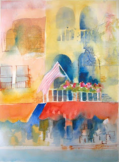
We had a busy day 3 and John demo'd two paintings. The first picture is my interpretation and the second is his demo. Since I took the photo, I've already dithered this painting some more (and so has John dithered with his).

One of the techniques in this demo is "gouache resist".
Gouache: gouache |gwä sh; goōˈä sh |
noun a method of painting using opaque pigments ground in water and thickened with a gluelike substance.paint of this kind; opaque watercolor.a picture painted in this way.
ORIGIN late 19th cent.: French, from Italian guazzo.

Anyway, the curlicues in the upper doorway are painted in gouache. Well, first a light wash. Dry. Then paint with white gouache. Dry. Then paint over entirely with a dark color. Dry. Then with a sprayer of water spritz off the layer of dark paint that rests on the gouache. Gently.

John has used a layer of light guoache also in the right hand corner to "mystify" that corner. I did it in the left corner but obviously I need to do it again more heavily.
This technique can be done with gesso (permanent) or with gouache (not permanent). Both require whisking the area with a soft dry brush.

I'll share the second painting tomorrow because I really was not anywhere finished with mine at 5 pm when I officially became brain dead.

Incidentally, the tiny bits of color in John's upper door is water soluble crayon.

Tuesday, June 7, 2011

John Lovett workshop Day Two

The temperatures in the north woods have taken a decidedly Florida-like turn! Wow, be careful what you wish for!

It is 91 in Lac du Flambeau, WI AND it is 91 in Leesburg, FL.!!! We are in shock again. But never fear...the north woods will always pop back with surprises and we expect a high of only 57 by Saturday. A person does NOT know what to wear up here!!!

Anyway, at Dillman's we work in AC! So we are happily comfortable. This first painting is my first attempt at a dock scene ala John Lovett style. It is not done. John critiqued it and I need more masts in the sky. John's demo on this is the last of the 3 photos.


My other try was from my own photo reference and it's not done either. This reference is from my own photos of Cross Creek, FL the home of Marjorie Rawlings (author of the Yearling)


Monday, June 6, 2011

Painting with a REALLY ugly brush


What a wonderful day! I started my first day with John Lovett at Dillman's resort in Lac du Flambeau, WI.

The first photo is our ugly brushes.
A gift from John for each student.

It is VERY hard to find such a seemingly useless brush!!! But darn if it does work just great! Who would have guessed!!!

Next is my first painting with John (with the flag and the flowers), then
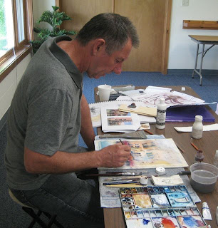
John's demo for today (with the boat) and last a photo of John painting.

John is a very lo-key teacher...always happy to answer questions and help you with your work.

He spent the first morning going over materials and techniques that are signatures for his style of painting which basically watercolor but with a multi-media approach! We did everything from glue
rice paper on to the paper (Arches 140# quarter sheets) to use all kinds of pencils (charcoal is two colors, watercolor pencils such as Inktense, and pastel pencils. And we also made use of old-fashioned dip pens and acrylic ink! We use gouache and gesso on the paintings too.


Like most workshops by 4 pm I was brain dead. It is also 86 degrees here! How this happened in the north woods I have not a clue.

We have AC in the studio so we are very comfy and I live right on a lake so we are comfy too.

I am all set for day 2 but I need a GOOD night's sleep.


Friday, June 3, 2011

Artsy Fartsy Shoes

Okay you Bob Burridge fans...those of you that got this week's Artsy Fartsy Newsletter...yup..this is what Bob suggests.

You have to "think outside the box" with Bob. This is what he calls "I-can't-think-of-anything- to-paint-today-so-I'll-paint-my-shoes" activity. My husband was speechless. You are doing what?

They were my old drippy paint shoes anyway, of course, and had lot of window paint and garage stain on them as well. Couldn't hurt these shoes. Now...will I have the guts to wear these to the workshop this week or not?

You have to admit..."they go with everything!". Hahahaha.
They will be perfect for in plein air, don't you think?

Thursday, June 2, 2011

En Plein Air in Minocqua, WI


It felt wonderful to be painting outside again...haven't done that since March in Florida!

You can tell from what I am wearing that I am in the north woods. It was 67 degrees at 9 am when we started but the sun was warm and we soon felt pretty comfortable.

Eleven artists showed up for the the first north woods event! Special thanks to Florie Enders who does all the organizing!

I didn't get around to get pictures of others painting as we were pretty spread out around the town. Hopefully Florie will have some on the North Woods blog and I can direct you to that later in the week.

I chose architecture this week...the Minocqua Brewing Company is a darling restaurant that Greg and I enjoy. Right downtown near Torpy Park. They are a home brewery too and make their own distinctive beers. (I am only interested in beer when it is ice cold beer and 100 degrees outside!) I think that might be awhile here. Most of us had lunch here after the paint out!

I chose two 12 x 6 gallery wrapped canvases for this time, primed in black gesso...painted in acrylic. My first diptych.

I'll miss next Thursday as I'll be in the workshop. But hope to be back on June 16.

Monday, May 30, 2011

Workshop Photos on my iPad


I know that ALL of you blog readers have taken many workshops (me too) and that many of you have GIVEN workshops (me too).

But once in a while there just seems to be one that initiates that amazing kind of electricity in anticipation that you can't quite define.

So it is that I anticipate a week long workshop with John Lovett (Australian watercolorist) beginning a week from today.

If you are a reader of International Artist Magazine, he writes columns in that magazine regularly, has made many DVDs and leads international workshops all over the world. Now he is coming to Lac du Flambeau, WI????? I know. I am amazed too. 15 minutes away from my tiny little cabin practically hidden in the woods. If you google Dillman's Resort you will find out more about where this magical spot is. And if you click on workshops you can find John's class description. (You will also find a plethora of very fine artists teaching there!)

I am sorry that I have only really a week to enjoy the anticipation and get ready. As you can tell from previous blogs, part of the week is taken up with just finding where my supplies have gone to and dusting off the studio and finding the supply list...yadda yadda yadda.

Thus the first photo of the initial supplies... finding just the right watercolors, gouache, gesso, pens, inks, pastel pencils, watercolor pencils, rice papers, and acrylics along with just the right brushes (almost all flats). I tore 3 sheets of Arches 140 cold press into quarter sheets this morning. I found that for the most part...I had everything I needed. He uses some very small flats for details but I dug some up.

One problem...I couldn't find any charcoal pencils in any of my catalogs. I am sure they are somewhere, but it seemed only in sets and I am asked to bring only black and brown. Sigh. Hopefully, he'll have some for sale? If anyone knows where you can buy these separately let me know. It'll be too late for the workshop...but maybe later.

I have decided to bring my photo references to the workshop on my iPad.
I sorted those I wanted to bring on my desk top into an album.
Then I synced the two devices and downloaded the album to the iPad. Voila.

You can see what the album looks like opened up with small photos. And I enlarged one to full screen to give you the idea. It'll be much nicer than trying to print it off on my inkjet and also much easier on the pocket book in terms of printer ink. The color on the iPad is splendid.

The battery is good for 10 hours so I should be good to go.
I'll let you know how that works out!!
I may do a few sketches from the iPad this week as our weather forecast is totally gloomy for the entire week!!!

Sunday, May 29, 2011

Making the Studio Ready for the summer


I don't know about you...but when I want to "work" the space needs to be somewhat organized and inviting. My studio is a 1/4 chunk of a nice garage here in northern Wisconsin. Last year I even got a real door that I can shut. My hubby put in a nice picture window for me a few years back so that I have some good natural light facing toward our lake.

The studio has been getting a little grungier the last few years and it surely does need more finish work, but I need to get going now...have a class with John Lovett coming up June 6 and my en plein air group starts up this Thursday. So today was unpack, clean, vacuum and organize day. It's not done..but I made a real dent.

I just got here from FL last Thursday and I do bring my paints back and forth because the cabin is unheated here (not good for paints) and because I want my brushes, palettes and some collage materials like some stencils and stamps and papers. Any paintings you see, however, were left here. I don't have room to carry paintings back and forth. I decided to hang more of them this year as it seems that otherwise they get knocked around and it's not good for the frames or the paintings to be "stacked". Our cabin itself has very little wall space for hanging paintings...so the studio has to make do for this purpose.

Weather has "moderated" somewhat here in the northern part of WI so that we are now averaging 65 most days. We might get into the 70s tomorrow although it looks like rain again! It would be fun to see where you all paint too.

Thursday, May 26, 2011

Transparent Watercolor Society of America


One delightful interlude on my trip from FL to WI this spring was a stop in Kenosha, WI to see this exhibit. It was amazing! The boat watercolor painting was at least a full sheet...maybe slightly larger. It was by Steve Rogers of FL and is called "Naoussa Light".

The second is by Catherine Hearing of Minnesota. Slightly smaller. It is called "New Vintage".

It was a large exhibit and I'll show a few more later. The joy of the transparency is, of course, the GLOW. These two demonstrate this dramatically.

Some paintings from past exhibits are online...just google TWSA.

Wednesday, May 25, 2011

Remember me?


We are finally back to our cabin in the north woods of WI...following an extended trip of sight seeing and visiting friends and family. Bet you thought I'd disappeared in a tornado. But that is not funny, is it. We drove through Alabama about 10 days after their tornados went through and we were absolutely stunned with sadness. And now Joplin, MO too.

Photos in this blog entry are from Callaway Gardens, GA on May 9 and 10. We enjoyed two days there. This little log cabin caught my eye one day...it was a steamy 97 degrees that day and I was so glad I'd brought a folding chair! I haven't gotten back to put in the printing on the cabin yet. And I need to throw a few shadows into the foreground. I took a TON of photos for later.

I'll try to get more of the travel sketches online soon.
I am trying to adjust to dial up again in the boon docks up here.
It is almost painful!
What a whiner!

Sunday, May 8, 2011

One Quick Sketch Before We GO


In the sunshine today it was 100 degrees in central FL. But the humidity was not too high and we had a lovely breeze. I think in the shade it might have been 90. It was just beautiful actually.

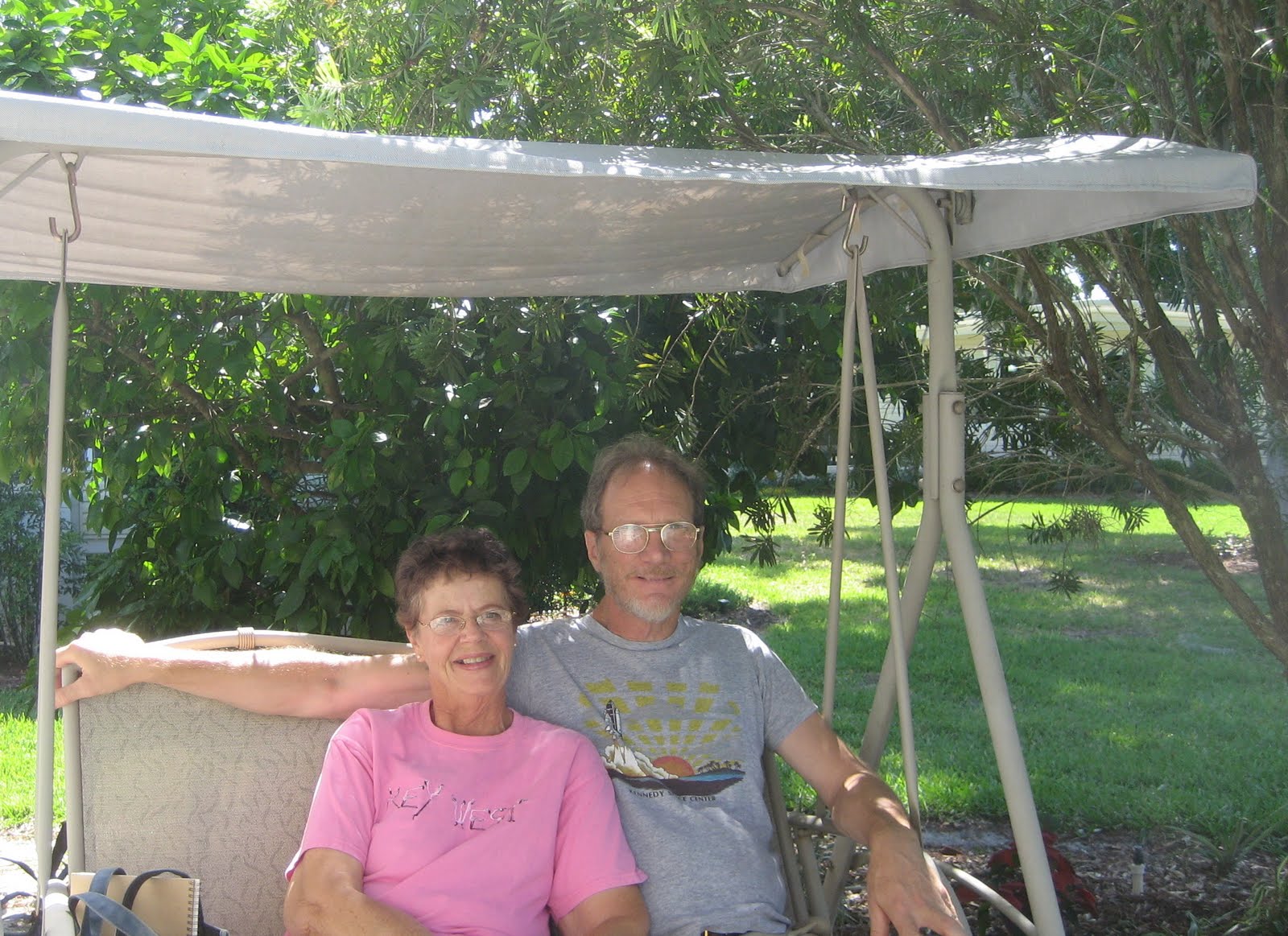
You'll see Greg and I enjoying one last swing in our back yard and I took out my sketch book and did a little sketch of our neighbor's porch/yard next door. They have already left for Michigan! I left a little vignette room off to the right so I can write some things about our last day.

I feel like we are the last snow birds to leave Hawthorne Park! But we probably are not. The really awful midwest weather has not enticed us to leave sooner.

We are about ready to pack the car now (BIG DEAL) and then we may go down and have one more swim in the pool and cool off. Hope to be back on the blog by Memorial Day Weekend. Hope everyone had a good Mother's Day!