Tuesday, August 2, 2011

En Plein Air Show in Woodruff, WI


Although I had 6 possible pieces to put in the show, I settled on these four.
Top back: Arbor Vitae Lake, Top right: Discovery Center: Manitowish Waters
Bottom left: Minocqua Brewing Company in Minocqua (local restaurant) and
bottom right: The Thirsty Whale: local hangout on Lake Minocqua.

These were delivered to Howard Young Hospital for hanging today. And the show should be ready to view by tomorrow (Wed, August 3 and hang through Sept 28).
Besides the local en plein air painters, there will be a concurrent show of the Manito Art League of a variety of art. So lots of fun pieces to view.

If you are local and plan to attend the show here are the directions:

Take Hwy 51 north to Woodruff to the 3rd Ave. (the stoplight at the Citgo Station).
Turn left on 3rd Avenue and go about two blocks to Maple Street. Turn left and you will be at the back entrance to the hospital at the gift store wing. Enter under the portico and turn left and then right following the art show signs past the gift shop.

IN addition, the People's Choice art show of the Lakeland Art League will open next Saturday morning so I am framing for that now. I'll have 5 pieces in that show. I am also in charge of writing all the identification cards by hand. I am almost done.

Note how dark it is behind the paintings through the window? It is not night time! The photo was taken about 10 am this morning. We were in the middle of a HUGE storm with blinding rain and dark dark skies and huge thunderbolts! Flash flood warnings everywhere in our area!

Monday, July 25, 2011

Picking Art for People's Choice Show

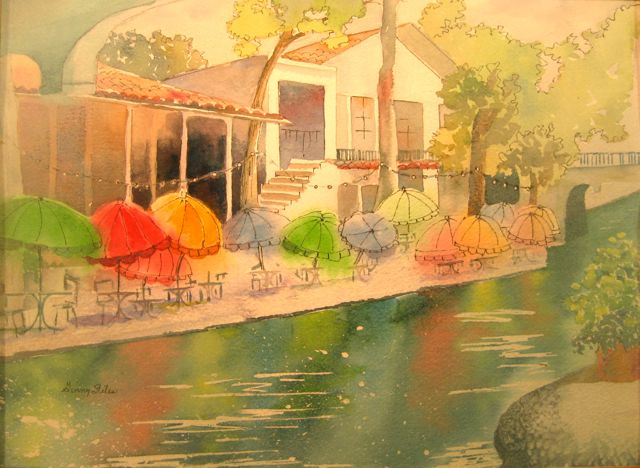
This is a painting I started awhile ago from a photo I took at the River Walk in San Antonio. It's a famous location for paintings...I've seen quite a few in art magazines and at shows. If you walked along this lovely spot you will instantly remember it. In the evening it is strung with tiny lights. Rental boats (like Venice) quietly motor up and down the river (at all times of day). They look more like pontoons than gondolas, however, but they are painted in bright colors and have interesting guides that chat as you go. Music from the restaurants and night clubs along the river float out onto the quiet evening. There are many bridges crossing the river (you can barely see one in the distance).

But this scene is early in the morning, as we walked along looking for a place for breakfast. No one was out yet, but the waiters were putting up the umbrellas and and it was filled with the sounds of birds. The boats hadn't started up again yet. I loved the reflections in the water and the early shadows and light.

It is a watercolor (not large)...about 11 x 14 on Arches 140#. I painted it mostly wet into wet hoping to get that "misty morning" feel to it.

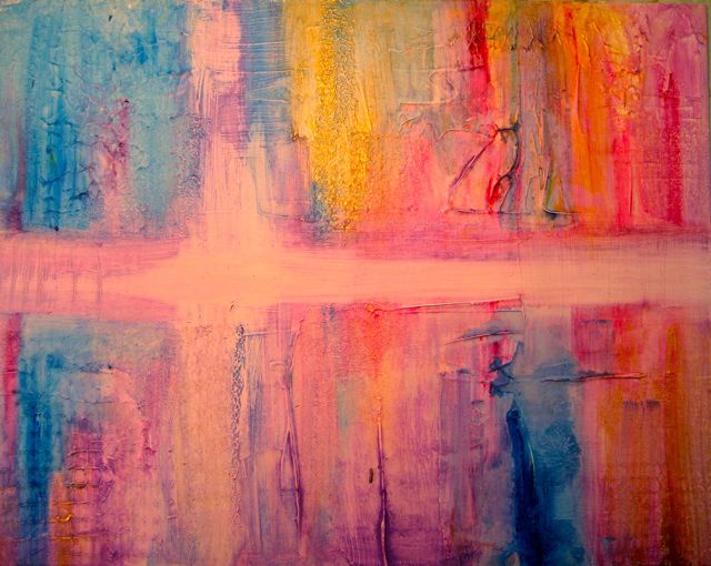
On a totally different theme...this multi-media (collage/acrylic) is a strange little "moody" piece contrasting a bright clown with a dark and somber background. I call it "The Train Left Without Me". The clown, though probably sad and lost, still has his smile painted on. The numbers in the painting infer lost time. It was an attempt at "story telling" within a painting.

Also fairly small, 11 x 14 on canvas board. I painted this shortly after I took Bob Burridge's class last summer. He was on a clown theme at the time and I must have picked up on that.

Bob paints in a series all the time...which is something I had hoped to start but I seem to jump around a lot in subject matter. With Bob it's fruit, or ballet dancers, or floral, etc. He paints and paints on that theme for awhile until he exhausts it and then on to something else. I wonder how many of you out there do that too?

I have picked 3 other paintings for the show. More on that later. The show starts on August 6th at the Arbor Vitae Community Center on 70 east. There will be signs up that weekend.

Saturday, July 23, 2011

En Plein Air on Blueberry Island

Our little lake Tippecanoe in northern WI has a number of islands...one "set of islands" we dub Blueberry and "little" Blueberry Islands. Great places for a picnic lunch!

We packed up the 4 grandkids and my son came along with us and we canoed and kayaked over to the islands yesterday. We took the usual: picnic blanket, lunches (watermelon and cookies, sandwiches, and chips, lemonade) and buckets for treasure hunters. Everyone had suits for swimming. Beautiful day!


After the picnic, while the explorers were hiking the islands and swimming around them, I took out my sketch book. Later we built a teepee for the little ones to sit in and then had a race home in the boats. It's not a bad life!

Friday, July 22, 2011

Back Yard En Plein Air


When you have a ton of company...and it's 98 in the shade...sometimes en plein air painting just needs to be in your own back yard! This was sort of experimental using that Daniel Smith Watercolor Ground on a piece of masonite. I did three coats, drying and sanding slightly between coats. But it is really hard to get it smooth and better to just maybe let some of the texture apply to the painting.

This is small...11 x 14" watercolor and gesso.
It's strange to paint on...sort of "chalky" and it does "lift well" but I am not at all sure that I like the surface. I am used to painting on glossy surfaces (like yupo) but this is sort of half way between. There is some surface tension but it also has some "soaking in" qualities. Difficult to work with, I think. Has anyone else tried this?

I missed my regular group painting on Thursday (due to tons of company). For once they didn't get rained out! Hopefully next week I can make painting with the group again.


Wednesday, July 20, 2011

Art Going Commercial

You will remember last month sometime I was working on some oak leave/acorn images for the Seno Woodland Center? Well, this month, my friend send up one of the commercial uses for the new logo. These water bottles were handed out at recent Eco Fair in Walworth County, Wisconsin at the Children's Booth.

It's fun to see your work out there in many different forms! I guess the color version may appear on a hat or a T-shirt later.

For my part...art is pretty much "on hold" right now as I have 4 grandsons visiting me. Photos to follow later. The summer is measured in weeks at the cabin so we play hard and fast while the weather is summery! Lots of swimming, boating, fishing, sailing, kayaking and cooking out! What I should do is go out to the studio from 5 am to 7 am! But what discipline would THAT take! Yikes.

Thursday, July 14, 2011

Asking for Your Input

My friend, Lou, from Canada and I spend the winter in Florida exploring art. This year Lou was wondering if we could, among other things, do a refresher on drawing. We know that Betty Edwards 1999 book, Drawing on the Right Side of the Brain, has been quite a classic for a long time for good reason. And it has a 2002 workbook to go along with it. I have copies of both of these that Lou and I can use for our "personal" drawing practice this winter.

In an initial exploration of the book and revisiting the ideas for her practice sessions this summer, I came across information about a DVD. The image here is from the DVD cover (not the book). You can get it from Amazon for about $35...it is a 2 hour DVD exploring the ideas from the book. I had never heard of the DVD (it also comes VHS).

I've never heard of anyone mentioning it, owning it, or using it.
So what I am asking out in the blogging community is if anyone has ever seen it and if so, would it be a worthwhile investment?

Lou and I began to wonder if maybe we could ask some friends to join us in our revisiting the discipline of good drawing. If anyone has ever seen or used this video or DVD, let me know.

You can send your ideas or reviews to ginny.stiles@gmail.com. Thanks


Manito Art Show (Manitowish Waters, Wisconsin)

Here I am at the opening evening of the Manito Art League show (Wed July 13th). A lovely event with wonderful food, good music, and a crowd of folks! The night is reserved for patrons and artists only. The show now opens to the public today through Sunday at two pm.

I have 3 watercolors in the show. This one called Windy Days was painted from a photo I took on the north coast of Ohio looking out over Lake Superior on a cold and blustery day!!!
This piece got "best of show" and it is a mixed media piece by my new friend, Christine Alfrey. It is really LARGE by any standards I go by! Christine is a short person. I would have loved to see her painting this one!


This is a piece in oil by my en plein air painter friend, Ken Drawz. The scene is real but he added a few bears to spice things up. Ken says this is a studio painting, not en plein air, and it is such a wonderful north woods scene that I bet that this one sells!!!

I have a few more photos from the show I'll share later.
Today it is DARK DARK DARK in the north woods and I am afraid our en plein air group is going to be rained out again! We seem doomed to rain every Thursday!

Saturday, July 9, 2011

Robin Zimmerman: Amazing Batik

Today I helped to judge at the Arbor Vitae Arts and Crafts show. Very fun!
Lots of nice art to see and enjoy with everything from fine art to soap and woodcarving and jewelry and wearable arts, etc etc.

This is Robin Zimmerman who won an award of excellence in the show. Her batiks were lovely and you might enjoy going to look at her work online. Click here. She has a lovely gallery of work to view. AND if you live up north you can see her work again at several art fairs including Loon Days in Mercer on Aug 3 and Musky Days in Boulder Jct on August 7.
Here I am awarding an honorable mention to a delightful quilter. I am so sorry I didn't write her full name down. I think her name is Kathy.


This is Charlie and he does macrame folding chairs and they are just amazing. Look for him at north woods art fairs this summer. He will do commission chairs if you wish.
It sure was an enlightening experience to do "judging"...my first time. Although I had "expert" assistance. We looked a creativity, originality, composition, design, and presentation.

Friday, July 8, 2011

Finishing up the en plein air painting

I spent an hour or so touching up the en plein air sketch that I blocked in yesterday. We all got rained out about an hour or so after we started. But I had a photo (see yesterday's blog post). The hard part about this was the "mystery paper". I had picked up something out of my folder of wc paper and it was already cut into quarters and so the brand of paper was missing. It was 300# but I have no idea what it was. Although I rarely buy anything except Arches, now and then for a class I might get a Canson, a Fabriano, or something else. This had absolutely NO sizing on it and everything just "soaked" in. Blah. It was SO hard to work on. If I'd only known! What a challenge!

Trying to get the gouache to work as a gentle blend-off of color (John Lovett style) on this absorbent paper just would not work. I tried several times. It just disappeared. I finally dried it thoroughly and used gesso which laid on top a little better.

The little "cabin" at the Discovery Center had no windows (probably storage?) which I think now looks a little odd. I can always add them later. I decided to leave them off because the little building is a "landmark" and is recognizable to people who go to the center.

Thursday, July 7, 2011

Rained out


We got rained out at en plein air today...I had just enough time to take a photo and do a little blocking in. Now I will have to finish up in the studio. I'll post completed in a few days. We painted at Discovery Nature Center in Manitowish Waters.

Thursday, June 30, 2011

En plein air in Arbor Vitae, WI


Here I am about 10:30 am this morning on a beautiful almost sultry summer day (the last day of June) en plein air painting with friends from Manito Art League. Arbor Vitae Lake is about 30 minutes from my cabin...and we were right near a wonderful pub for lunch (Slo's Pub).
There were about 10 people there painting in many mediums!

I was determined to try out some more of John's Lovett's techniques en plein air.
So...I blocked off areas, used masking tape to mask off the birch tree trucks, added some india ink (with nib pen) and even use gouache to blend off the edges of the painting on location. That was one experiment to see if I could handle that out of doors.


Afterwards at lunch overlooking the lake, we all enjoyed sharing art...hearing about what each artist was "aiming" for. this is Joan Stevens talking about her lovely watercolor.

I decided on mine, as usual, I am too washed out and need more darks and contrasts. Not more detail though. Mine was about 8 x 10 on 300# Arches. I'll post more of other's work in another blog soon.

It has clouded up this afternoon and smells like rain coming. I am so pleased it held off...as it was not predicted to be a good morning! What a surprise gift!!!


Monday, June 27, 2011

A Painting for Barb Sailor


One of the fun things about blogging are all the interesting people who you "cyber meet" and learn from. Barb (her blog is under my blog list to the right) and I have been chit chatting about my recent class with John Lovett in the early part of June. (See my June 6,7,8,9 blogs below).

Our focus of discussion is how to use John's watercolor techniques en plein air.
John's class was painting from photos but one "should" be able to extrapolate to outdoors, wouldn't you think?

This little 8 x 10 watercolor was in studio (not en plein air) but I thought about it as if it were en plein air and how to approach it. Below see how I "blocked" with watercolor. I put the paint on rather intensely for a first block...but when you are working out of doors you don't have time to do many layers. I tried to think of shape, color, composition, center of interest. Just as in any medium. (Barb has been painting in oil out of doors.)


I did very little drawing...just a few pencil lines.
John sticks with 4 colors (phalo blue, aliz crimson, quin gold, and prussian or ultramarine blue.) I admit to drifting off a little bit but basically that is what I used. I added some scarlet lake to the roof color and I wanted to keep things very warm. I think I may have used a little aureolin yellow too.

The red flowers were magenta acrylic paint and I used gouache mixed into some of the drippy flowers. I also used gesso thinned to mist off edges. Now whether or not I'd do the gesso bit while en plein air or not I don't know, but I might. You need a big soft brush for that. I also used some acrylic ink with an old fashioned nib pen.

Today is VERY dark, and damp in the north WI woods and not at all an en plein air day. But we are supposed to have sunshine for our out door group this coming Thursday morning. So I will take my watercolors and see how this approach translates. Barb has ordered John's book...I have a ton of his magazine articles from International Artist Magazine and three of his 10 minutes videos. So I plan to keep plugging away.

Saturday, June 25, 2011

Christmas Collage Fun

Well, this photo looks a tad "pinker" than it really is...it's really more purplish. My ideas is to get away from traditional red and green and go with the purples and gold of the Church colors for Christmas. With a little Phalo Blue for contrast. The thinned acrylics were rubbed onto the gesso textures with paper towels. I've added some tinted sheet music with words that seem to tell of memories, friends, and golden times. That's sort of the theme.

My original thought was to add tinted and aged photos of family gatherings but I see that it is really too small a piece (11 x 14) to do that well. So now I am thinking of maybe using photos of us and the grandkids...collaged in. I am not sure...It could get too busy that way.

I need to let everything dry now and then come back to it. Maybe just one strong image somewhere near the center of interest.

Before.

Friday, June 24, 2011

Pondering

I recently wrote an email note to my former roommate from college. Now note, I did not say my OLD roommate from college. This would predicate the need to remind everyone that if this person was my roommate in college, how OLD would that make ME?

So anyway…this email I sent to her first was a reflective piece on aging and time, and precipitated by our upcoming 50th college reunion in October. I concluded with “It's just part of being human...struggling to help each other along the journey and sharing adventures along the way. The sweet sadness of time passing. We need to hold hands as we cross the streets. “

So now she has me labeled as “person who likes to ponder”. So she sent me a list of silly things to ponder like Why isn't the number 11 pronounced onety one?

Actually I do ponder things like that! :-)

Meanwhile, the whole thing started when I went back to re-read the Christmas cards and letters from last Christmas (I always do this in the summertime) and started thinking about a collage for my Christmas card this year. THAT is what this strange surfaced canvas board is all about. The support for a collage. A Christmas theme…pondering Christmas past for hints on how to live for Christmas present. Ideas anyone? Are you pondering?

Tuesday, June 21, 2011

The Re-Do

One really nice thing about the iPad as a resource for photos is the ability to go back and look at a painting and use some of the original painting for the re-do. Naturally, the original is no longer in my possession. Neither is the original photo unfortunately. But with the photo...I could make a reasonable stab at the re-do.

Basically, as I noted in the previous post, white oak acorns do not have "stems" and so they had to disappear and the leaf lobes needed to be deeper. So we'll give this a try!

Meanwhile we are being drowned in Northern Wisconsin. Whew. RAIN RAIN RAIN. High of 59 today. How's that for the first day of summer! No sunshine in sight until "maybe" Saturday.
If this sounds like a little weather whining...well, so be it!!!

Our bathroom remodeling is really moving along, however, since we are not tempted outside. I may post a few photos of that. Painting is painting?

Sunday, June 19, 2011

White Oak Commission Revisited

Well, it's time to re-visit the oak leave/acorn commission in a slightly more "botanical" way.
Come to find out what Kendra wanted were WHITE OAK acorns. Good old Quercus Alba. Of course, why didn't you say so.

White oaks are 60-100 feet high, 2-3' in diameter..tall and straight in the forest, rounded in the open...with irregular and heavy limbs. (You don't want one of these babies falling on your roof!)

Bark is pale gray and scaly and the leaf is deeply lobed. Sometimes the leaves remain on the tree all winter.

The fruit is a light brown (green in spring) acorn maturing in the first year enclosed in a cap.

The white oak is common on better soils in the southern half of Wisconsin. It's wood is light brown and is good for heavy construction, railway ties, interior finish, furniture and fuel.
Forest Trees of Wisconsin, Department of Natural Resources Bureau of Forestry 1990


So...the issue of making these more botanical than previously posted has to do with more deeply lobed leaves AND the acorns are NOT on stems as previous drawn but rather close together on the twig near the leaf.

Thursday, June 16, 2011

Solace when the En Plein Air gets rained out....

Well, actually my en plein didn't get "rained" out, it got "darkened" and "cloudied" out. My spell checker says there is no such word as cloudied. Hahaha. But believe me, it was dark all day...windless (that was good) but not a shadow, not a color, not a peep of sun. For me that is a no-go as far as painting out of doors. I was VERY disappointed. Big sighs.

So...while my husband was sanding the last of the preparation for me to paint the bathroom (on Friday), I snuck over to the studio to play. I decided to use a photo reference I took last fall (November, I think) at Dora Lake and in Mount Dora, Florida. They have a garden show down by the lake shore. And this little lighthouse sits there on a rock outcropping. It's kind of a "symbol" for the town.

I thought this might be a good time to experiment with some new materials. I pulled up the image on my iPad and did a little rough sketch...moving things around where I wanted them...putting the flag pole into the center of interest, making the palm trees more prominent so that the tropical feeling would be there.

A few days ago I put three coats of Daniel Smith watercolor ground onto a canvas board. Three coats is what they suggest, sanding in between each coat. I applied it with a foam brush thinking I'd eliminate brush strokes that way. They also say you can thin it with up to 10% water. I think for the last coat I should have done that. It went on so thick that I still got brush strokes and even with the sanding, they were apparent. So, I learned something there right away. The paint did not "bead up" on me but it did lay on the surface more than regular paper.

I expected the dry surface to be a lot like either yupo or watercolor canvas. It has a consistency all it's own, however, and is different from both of those. It's hard to describe.
You can, like those others mentioned, lift back to white very easily and it is also difficult to get dark dark unless you use very thick pigment. I still need to go back and add more darks to my little "trial" piece above. I had to give it a light coating of acrylic varnish in order to put on a gouache wash at the end.

I also wish now I'd put the little people on the bench closer to the center of interest too. So this painting may be a "do-over" one of these days with a little different composition. I will try the watercolor ground again...more water and more sanding OR I will be deliberate about the textures and add them where I want them in order to enhance the subject matter...another experiment! I also think I need another taller palm tree.

I also taped the matting before I started.
It is 14 x 11 with a a 2" faux mat around the outside. So the painting itself is 10 x12.
Just another experiment.


Wednesday, June 15, 2011

North Woods Pond


Last summer, this was my first en plein air painting of the season. I tucked it away intending (don't we always) to finish it up and put some last minute touches on it one of these days.
Here it is a rainy afternoon the following spring.

This is an 11 x 14 watercolor/mixed media on canvas board.
I almost tossed this one (or painted over it).
But then I decided to take one more chance with it.
I did still have a photo reference to go with it, taped to the back. That was a life saver.
I recommend you do that when you "file away" a painting to come back to. Or make some reference to where the photo is.

Canvas is forgiving and it's easy to come back to almost white in some places and change colors or shapes. Dark is very hard to achieve and has to be put on in 3 or 4 glazes with lots of pigment and not much water.

So I darkened the center of interest, added some gouache or acrylic highlights, worked a little more on the reflections, added some black sumi and some acrylic burnt sienna ink lines, and splattered some color. Gradually the warm, windless morning in the sunshine came alive again for me. The sounds of the birds...insects buzzing...even the gentle voices of other painters nearby.

Note, I did decide to fade out the edges but with a watercolor on canvas you just can't do that like you can on paper. So I gave it a light spray of clear acrylic varnish before I added the vignette technique. This worked fine. When I decide that it is done, I'll put two or three more coats on the painting so I do not have to use glass when framing it.

I did not jot down the name of the pond and I am going to ask Ken and Florie what it was called.


Monday, June 13, 2011

The Oak Leaf Commission

An interesting project has come up for my weekend painting. My friend, Kendra, wants to put a "logo" on some stationery and brochures, etc. for her nature and forestry center. She knows she wants oak leaves and acorns. She knows it has to be a simple image. My first image is a classic watercolor. It might work for some of her needs and probably not for all.

This image is almost the same but stylized and inked. Simpler.


This image is shown on a light table...as I am changing the image to simple black and white ink line drawing. I did two of these simple ink drawings...one even more simple than this one. Just in case.


Last I did add a negative image. Just in case she might find that an interesting option.
More to follow and I'll let you know if any of these worked for her. I think she is thinking tee-shirt or maybe cap logo and she probably has some printing that will go along with it. I am sure she plans to reduce the size way down.


Sunday, June 12, 2011

Before and After


So the first image is an en plein air I did at the North woods Discovery Center late last summer.
It never was "finished" and I was not sure exactly how I would finish it off.

So, I decided, for fun to use John Lovett's techniques to finish this off. There was no real "center of interest" in the painting. So I chose one and I worked to make that area look lively and subtly "interesting". I aged the pink chair a little with some rusty nails using burnt sienna ink, contrasted the light and dark dramatically at that area, and vignetted off the other areas of the painting. I made the floral background more interesting with dropped and splashed in "inferred" flowers using gouache and
acrylic paint and used sumi black ink on a nib pen to give more interesting definition to the trees and the chair itself. I warmed the foreground with quin gold watercolor dropping in a little permanent rose to balance the pink of the chair.

What d'ya think?