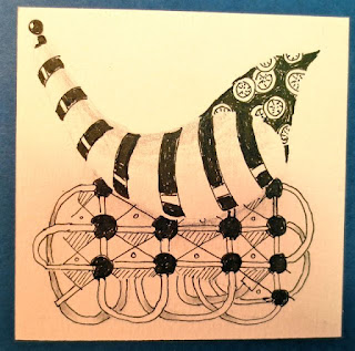
I feel I have sort of "turned a corner" now with these lovely patterns.
Although I am still basically using ideas I get from other artists to push the limits of the designs. I am beginning not to just "toss the dice" in my decision about which patterns to use...I am more interested now in seeing if the basic good elements of composition can actually come into play...dark/light and busy vs calm, organic vs structural. I am more interested in shape and theme. There are levels of accomplishment in all art.
Any use of color, for me, is very limited. I still feel that in true Zentangle® the design should be primarily black, white and gray.
 These two designs represent, I think, a step forward in my design presentation. They show a lot more confidence in pattern-making and they are beginning to flow better with more sense of confidence and personality.
I have begun to sort through the many Zentangle blogs and ferret out just the few that I think are REALLY artists in the field and those who are just "fiddlin' around" and having fun. Which is just fine, of course. Most folks will find that is just enough.
But like all artistic endeavors, there are levels to the playing field. Some of the Zentangle® art I am seeing is simple divine. I believe that in the next levels (should I choose to carry on) one begins to make up your own patterns and to devise ways to change and stretch the patterns that are already known into patterns that I make up myself.
I am now reading that there is one artist who is teaching classes on how to Zentangle on your iPad. Kind of fun. I'm keeping my eye on that too. Seems to me "shading" would be the issue there. For me, shading the designs is what makes this an elegant art form. But I'll be there is a way around that too.
Both of these tangles here are larger than normal ones...created in the 5.75" square for demo purposes and done with ultra fine sharpie because they are not on paper. I am numbering them (you'll see an 8 on one) so that I can refer to the patterns when I am teaching.
Right now I am basically enjoying using Canson Montval WC paper (#140 cold press) for my work and teaching. Fairly inexpensive but french made paper and pleasant to work on. The paper recommended for this art is Fabriano Tiepolo Printmaking paper. Dick Blick has it for $6/sheet and you could cut a lot of tiles from a 22 x 30" sheet. So when I run out of Canson I may try some this paper (Italian made). Over the past week I have sort of "inventoried" my pattern collection (about 100 patterns now) and starred those that are easy and those that I love best. www.tanglepatterns.com continues to tempt me with her pattern of the week which I enjoy.


